Build a connected management dashboard in a day

Many impressive new tools are launched each week. To experience the progress of AI tools, I set out to create my own web application using an AI coding platform.
Why is it so difficult to monitor basic company metrics?
In this blog, I provide a tutorial on how to build a web-based company dashboard in a day. Connected and insightful metrics are no longer a luxury but a necessity for management teams to cope with the massive impact AI is going to have on every business and operating model.
As Warren Buffet said:
"In the business world, the rear-view mirror is always clearer than the windshield."
You could interpret this quote as saying that it is easier to look back and criticize mistakes based on hindsight. However, understanding Buffett’s approach and his reliance on historical data and strategic foresight, it’s more likely that he views past data as a foundation for making better future decisions.
Every company or team that wants to make progress needs dashboards with regularly updated information.
The real strength lies in combining different data sources to enable meaningful interpretation. For example:
- Gain insights into revenue and cost-to-company to track performance and gross profit.
- Standardize monthly reporting metrics for investors, such as EBIT development and progress on strategic initiatives.
- Monitor product performance metrics like CoA and CLA.
Have people given up on near real-time company dashboards that connect multiple data systems? It’s fair to say that Power BI and similar tools have not fully delivered on their promises. The issue wasn’t (only) that they weren’t open enough, it was that the necessary data sources were often inaccessible.
The first step is to map out the metrics of interest. Depending on the type of company you are - for example an agency or product company - you look at different metrics. In the dashboard you categorize the metrics in disciplines such as finance, sales, marketing, operations. Some example of metrics that are relevant to every company:
.webp)
In an ideal world, you would have an automated data connection between the source data and the Google sheet. That’s not going to happen. For each metric you map out the data source and its potential to connect to an outside system. When I build dashboards, I usually populate the dashboard with 100% manual entries, just to check if it shows what I’m looking for. Once you have an understanding of the data sources, you can start connecting.
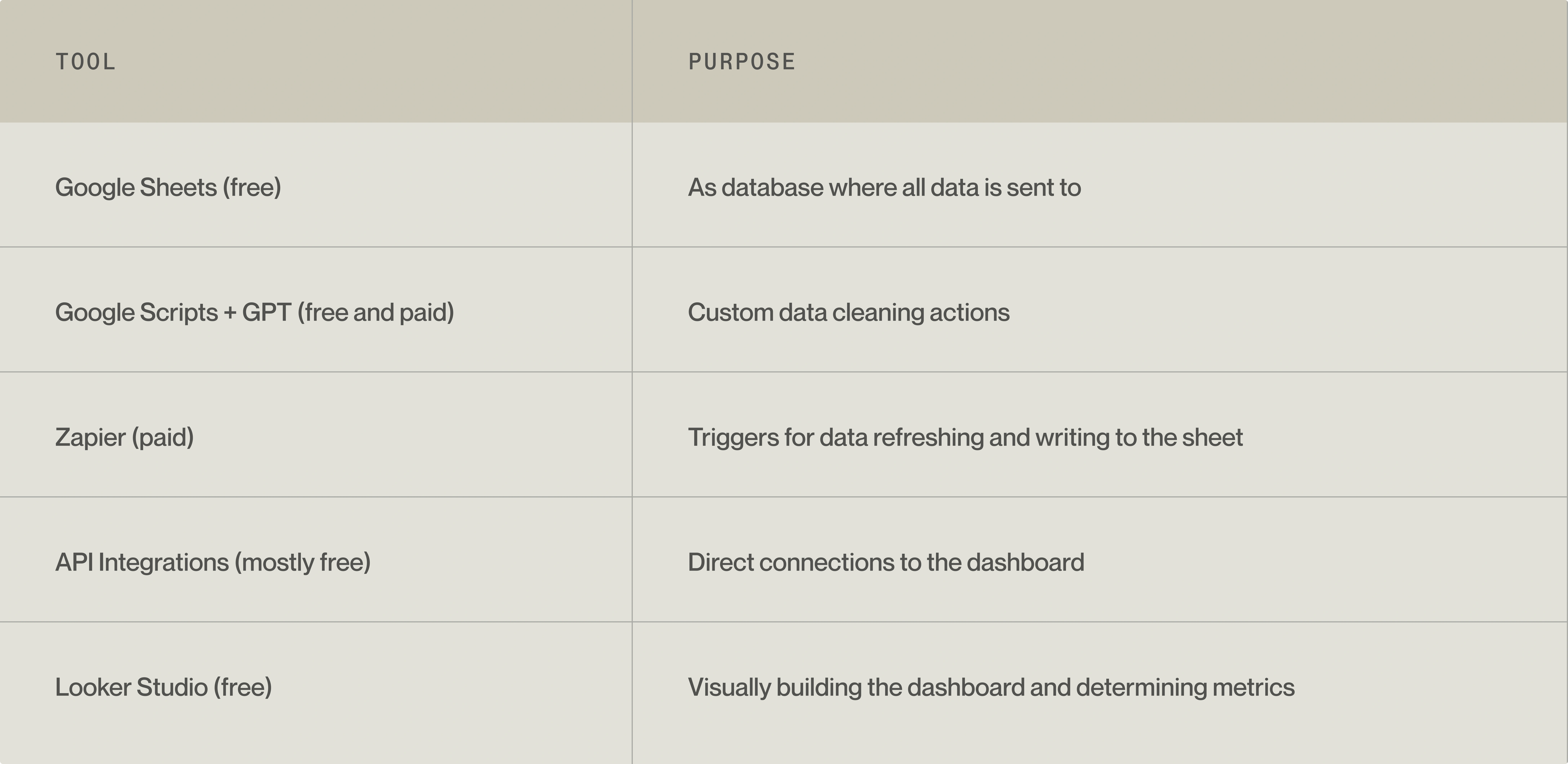
Generally speaking, you can get automation to at least 80% of your ideal dashboard with these tools:

Step 1: Start at the end
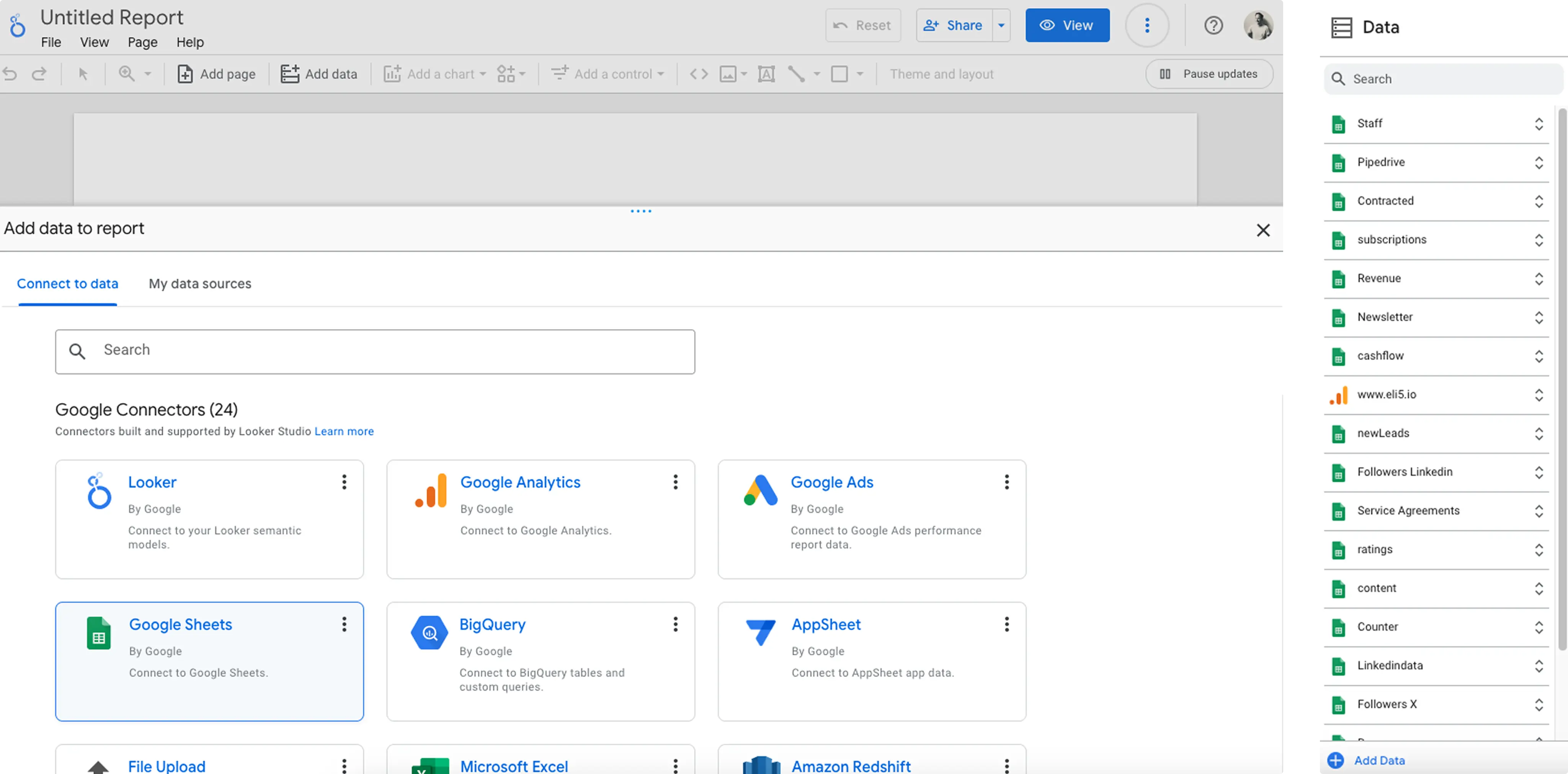
We start with what the users want to see, and work from there. Create a google sheet and connect it. The google sheet functions as a database. Every “group” of data gets its own tab in the google sheet. This allows for more control in presenting the data properly.
From the suggested metric list in the beginning of this blog, you can already set up an informative dashboard. The management dashboard of Eli5 has over 20 sources, monitoring status and health of the organization. Each group of data points as seen on the image on the right, is located in a tab in the google sheet. Basically, there are four relatively easy ways to collect data:
- Directly from the Google Connectors. For example: google analytics data can directly be used in the dashboard
- Integrations via zapier. Many platforms can interact with zapier, which means you can extract data via zapier to your google sheet.
- API directly to sheets. Via the Import data function (‘=Import data’) you can directly import data from an API into a sheet.
- Via manual exports/imports and manual entries. Some (legacy) systems just don’t connect and you have no other option than to export data and import it manually into the data tab

Step 2: Data structure
Each datapoint should have its own header - the name in the first row of the sheet. In this simple example each month the # followers on our linkedin pages are scraped.

When you load this tab in Looker studio. You can create a ‘score card’ which is able to show the latest data point, alongside a percentage change based on the previous datapoint.

Step 3: Connecting to an external source via Zapier
Eli5 uses pipedrive as CRM. Suppose we want to extract the deal funnel value and the number of scheduled meetings from Pipedrive. We can make use of the existing connector between Pipedrive and Zapier. You sign in to pipedrive via zapier and select which things you want to extract. By a (overnight) trigger, this data is sent to the google sheet every day.
The challenge here is to update existing data. As there is no function in zapier to do that properly, the best you can do is to clear all the data in the sheet before you write the updated data to the sheet. This ‘clear’ function needs to be included in the google sheet itself. Now GPT comes in handy.
Step 4: Custom scripts with the help of GPT
Suppose like many other, you are not familiar with Gscript the scripting language of google sheets. GPT can easily write the script just by asking: “can you write a gscript that clears all rows of a sheet.”. Part of the result:
function clearPipedriveRows() {
 // Open the active spreadsheet
 var spreadsheet = SpreadsheetApp.getActiveSpreadsheet();


 // Access the specific sheet by name and verify its GID
 var sheet = spreadsheet.getSheetByName('pipedrive');
 if (sheet && sheet.getSheetId() === 1XXXXXXX) {
   // Clear rows 2 to 1000 in the 'pipedrive' tab
   sheet.getRange(2, 1, 999, sheet.getLastColumn()).clearContent();
   Logger.log('Rows 2 to 1000 cleared in the "pipedrive" tab.');
 } else {
   Logger.log('Sheet "pipedrive" with GID 1XXXXXXX not found.');
 }
}
Just copy this to menu [extensions] -> [app scripts] and save it. Done.
GPT is helpful and detailed with regards to almost everything related to the dashboarding. From setting in zapier, writing gscripts all the way to Looker studio. It knows its way around it.
Step 5: Make the dashboard pretty
Once your data is structured, use Looker Studio to build a branded dashboard with key metrics, graphs, and insights. While Looker Studio isn’t as design-friendly as Figma, it offers extensive customization options.
Our management dashboard at Eli5 integrates over 20 data sources to monitor the company’s health. As companies grow, dashboard architectures become more complex, but the fundamental principles remain the same: collect, connect, and visualize data effectively. In our work with clients, we frequently encounter dashboarding challenges on a significantly more complex scale. My colleague Andre wrote a blog about how we create data-heavy dashboards as efficiently as possible in this blog.
Concluding
Data and IT complexity is no longer an excuse for not having management dashboards. With LLMs, users can now interact with APIs using natural language, making complex data extraction accessible to nearly everyone.
I therefore would like to repeat: connected and insightful metrics are no longer a luxury but a necessity for management teams to cope with the massive impact AI is going to have on every business and operating model.


.webp)
.webp)


.webp)

.webp)


.webp)


%20(1).webp)


.webp)
.webp)


